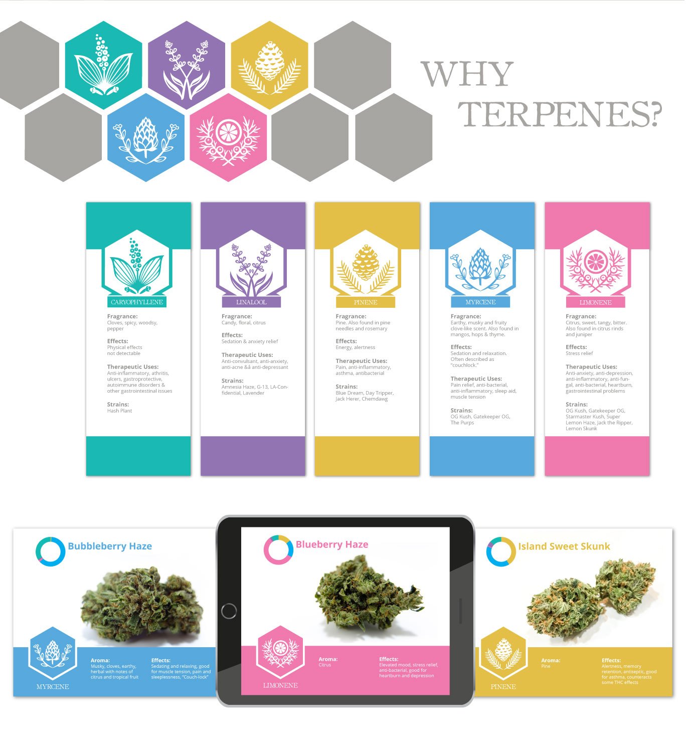

I worked with Zion to update their logo & build out their branding guidelines. I took their existing logo, cleaned up & modernized it, and provided different variations of the mark. Their whole approach is to highlight terpene profiles within different strains of cannabis and products. They wanted a custom set of icons built to highlight each prominent terpene profile and were hoping to integrate that into their menu design.
Each terpene profile was color-coded so that we could build out graphs in the menu to show percentages of terpenes within each strain. A strain can have different aromos, tastes and effects depending on the level of terpenes in each one. The goal was to streamline the experience for customers to easily identify products with the terpene profiles that they desired most. I also designed a set of icons to show all the types of items they offer, such as flower, concentrates, edibles, etc. Those icons were featured on the menus in store and online in the website.
In addition to the menu designs, I created various infographic assets to provide additional info on each of the terpenes and tv/tablet graphics to highlight specific strains which were shown on the monitors set up in their shop.

